- My role
- Brand identity design
- Discipline
- Brand Identity
- Tools
- Illustrator, Photoshop
- Deliverables
- Logo & app icon, Color & type system, Payment card, App UI visuals, Stationery & merch, Campaign & OOH
Overview
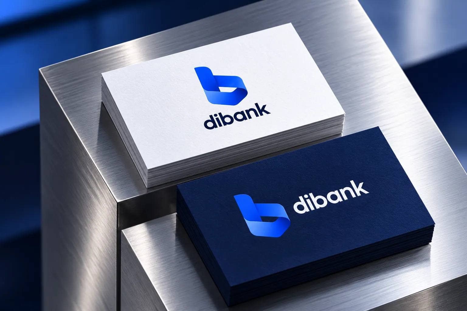
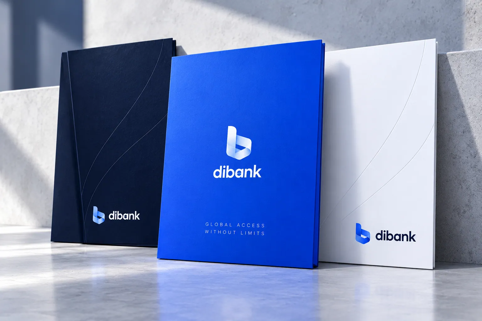
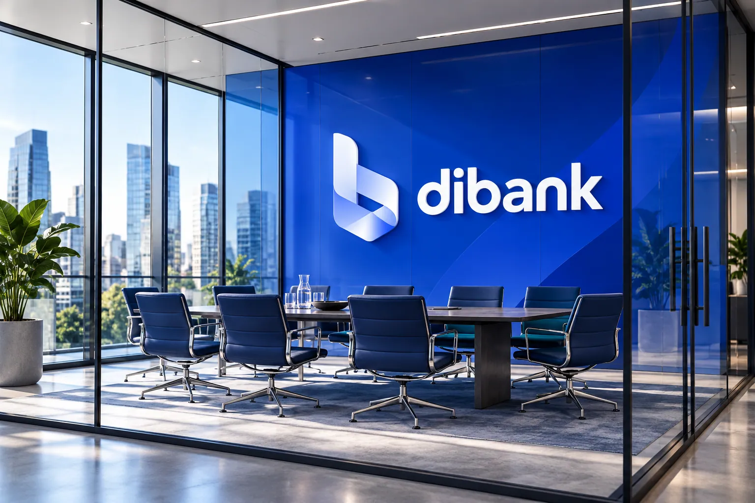
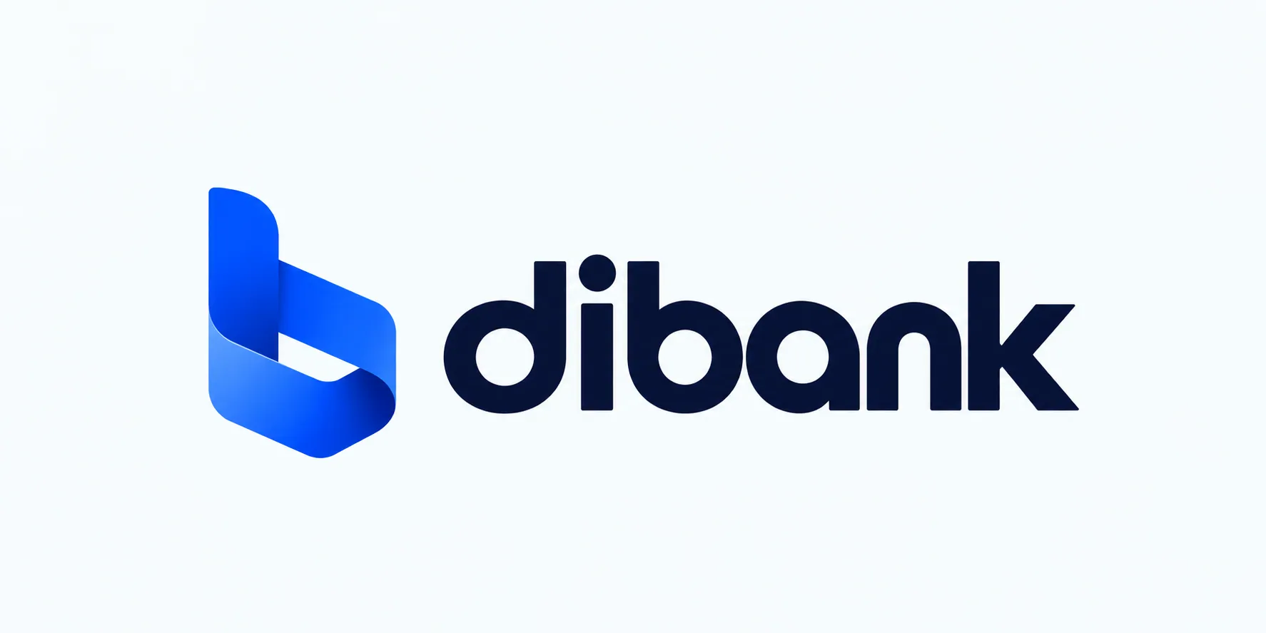
dibank is a brand identity for a modern digital bank. The mark is a folded ribbon “b”, a single continuous shape that suggests money moving forward, rendered as glass in 3D applications.
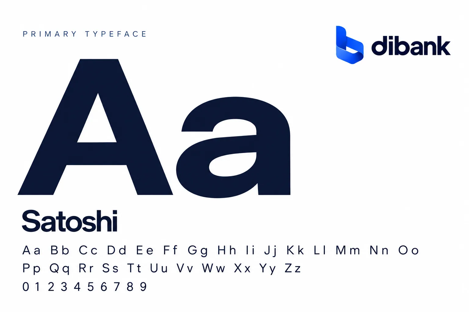
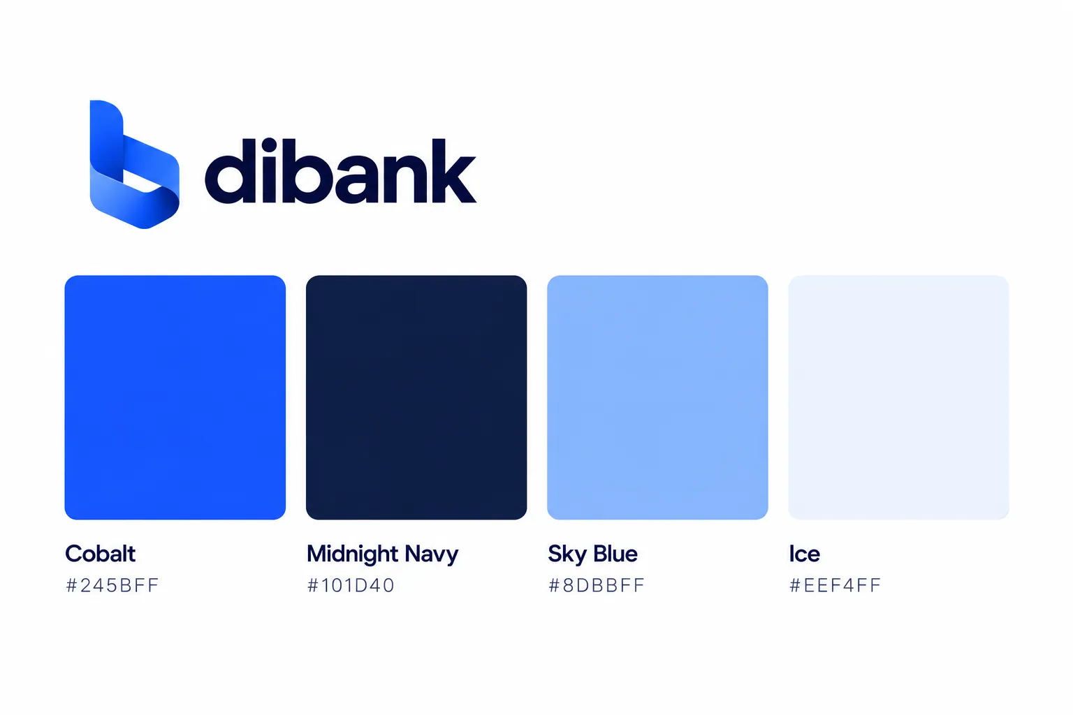
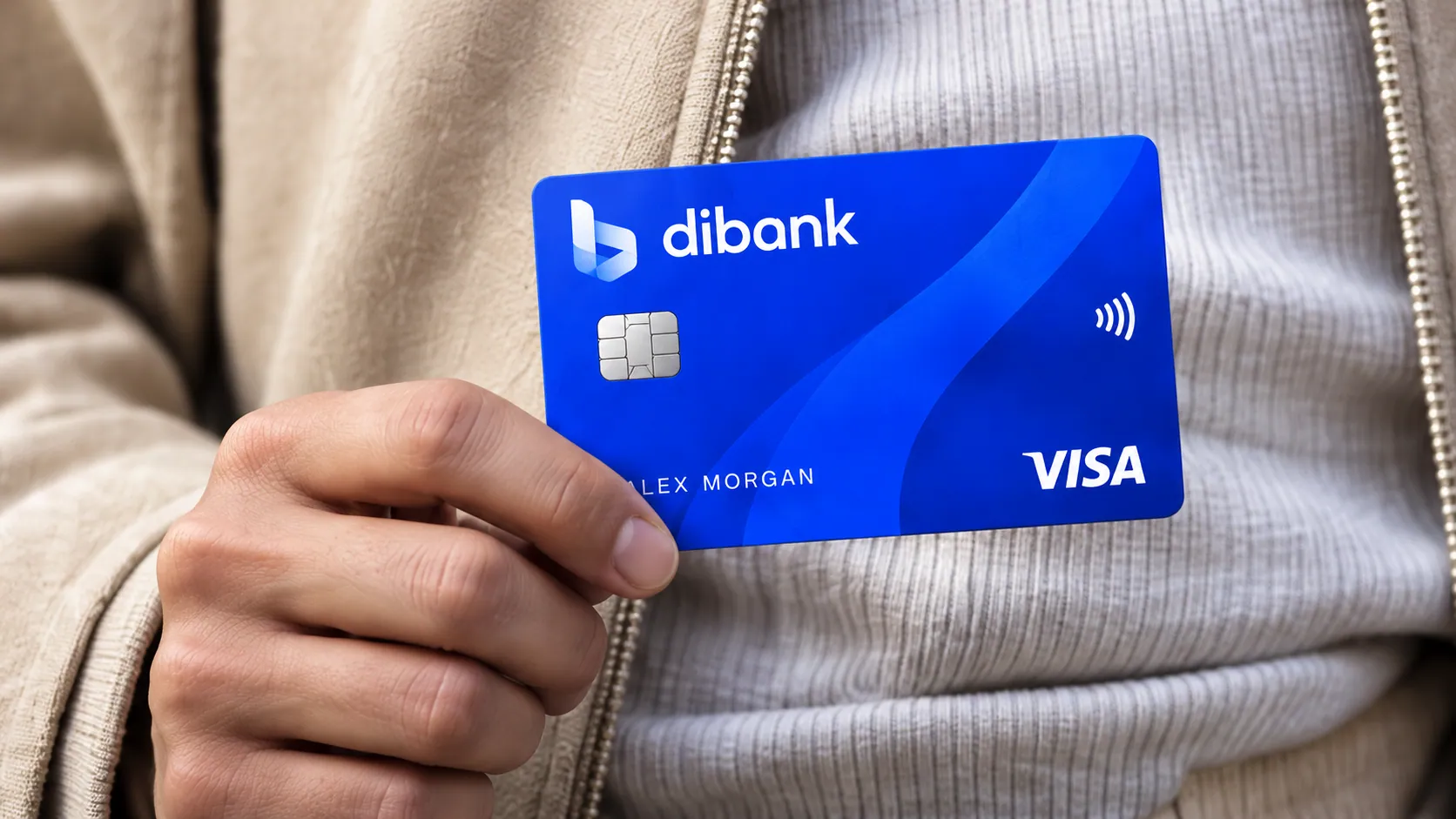
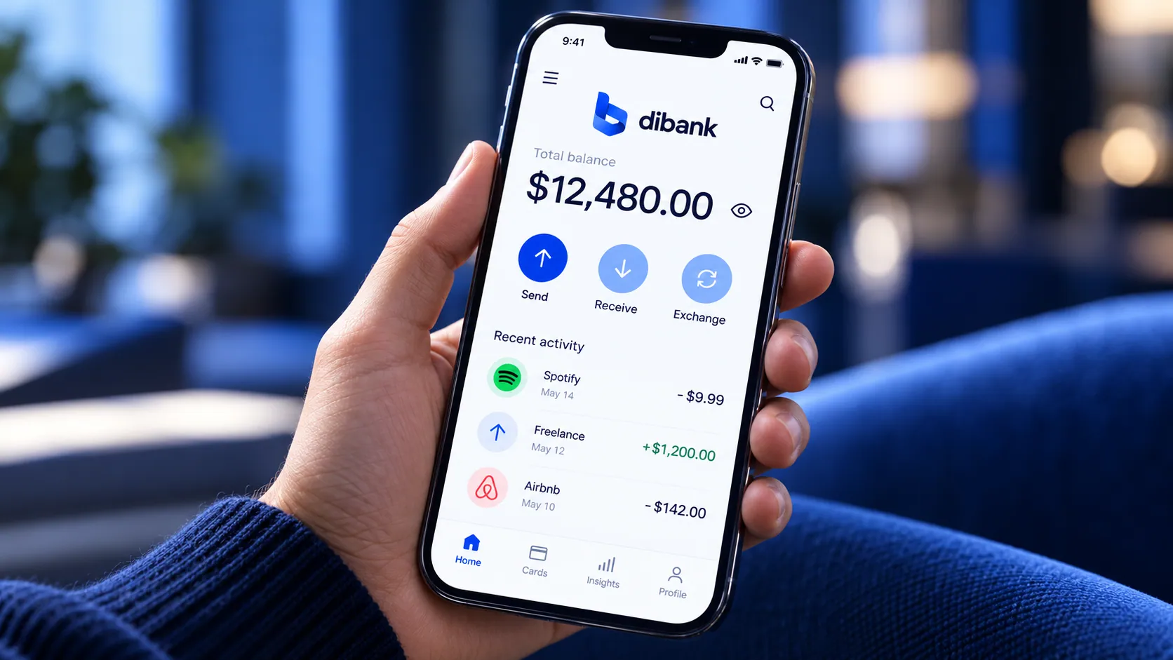
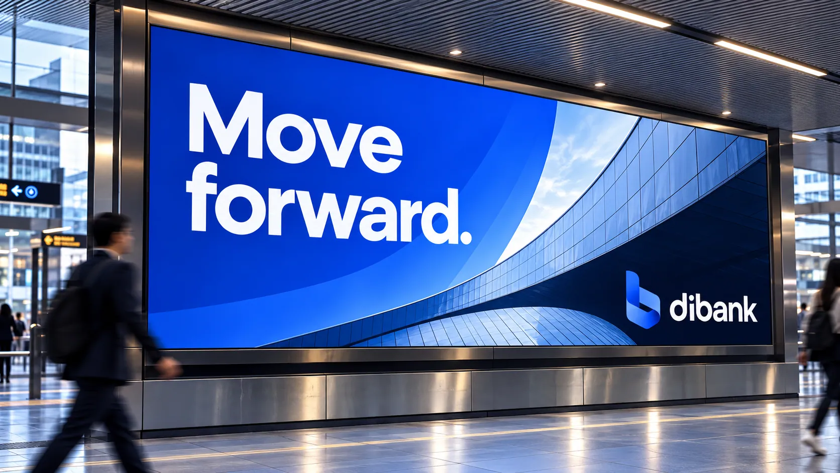
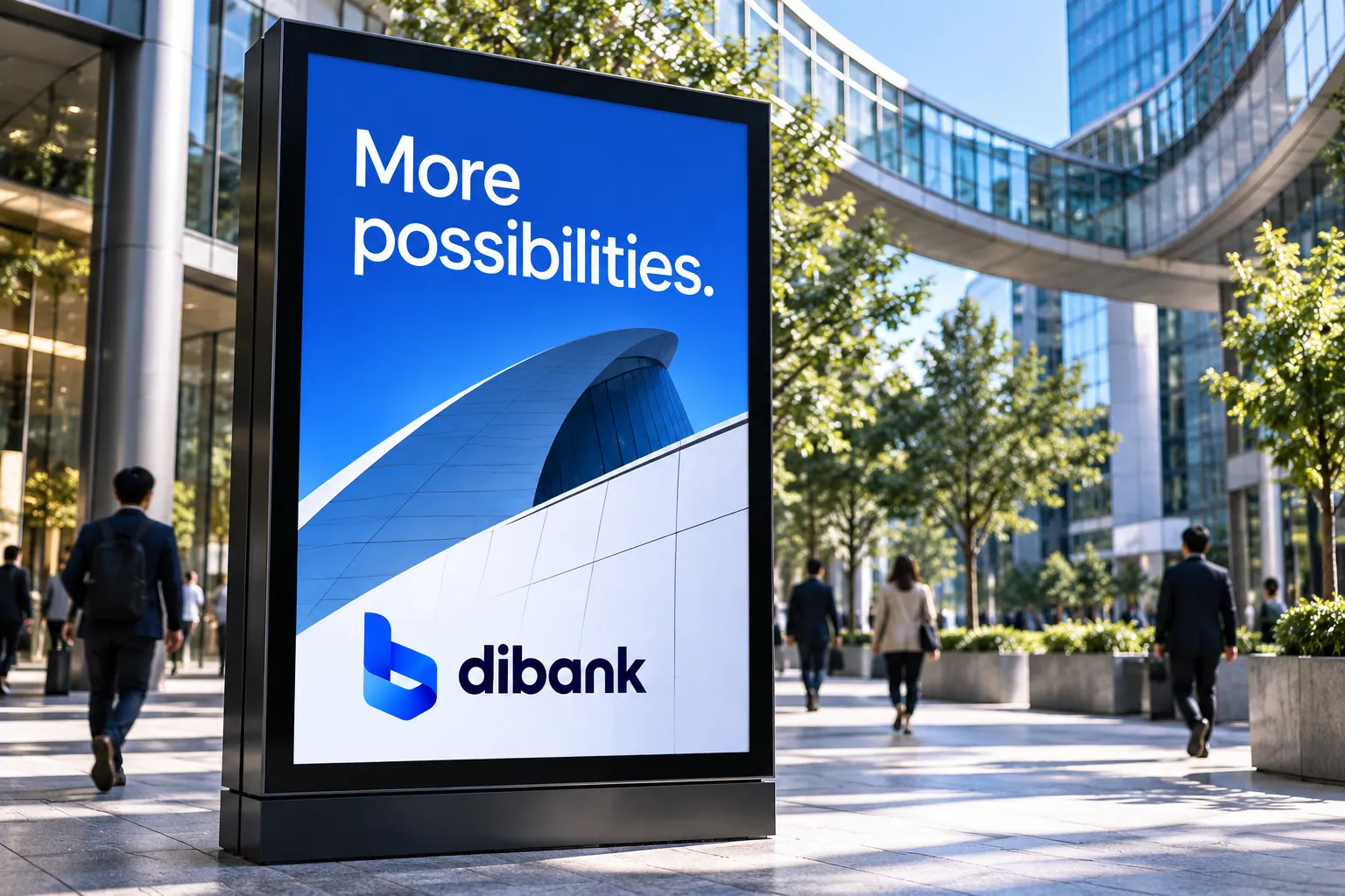
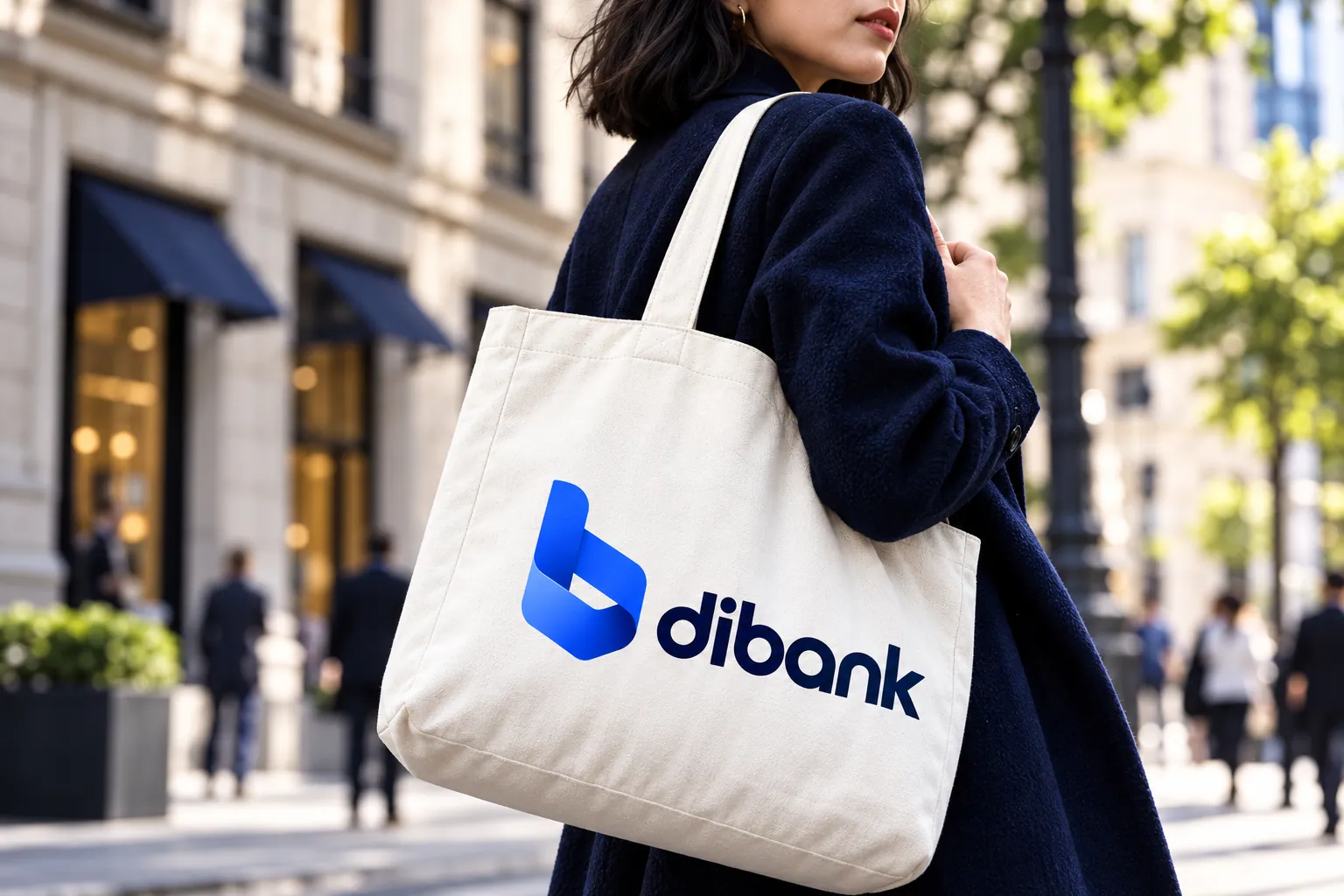
The system is built on four colors, Cobalt, Midnight Navy, Sky Blue and Ice, with Satoshi as the primary typeface. It is applied across payment cards, the mobile app and its icon, stationery, merchandise, office signage and an out-of-home campaign: “Move forward.”, “More possibilities.”, “Money moves people forward.”

Color & type
Cobalt
#245BFF
Midnight Navy
#101D40
Sky Blue
#8DBBFF
Ice
#EEF4FF
Aa
Primary typeface
Satoshi